#but this was a fun chance to use firealpaca again and make something with a Real Background that uses Perspective
Explore tagged Tumblr posts
Visit Tumblr Blog
Explore Tumblr blogs with no restrictions, modern design and the best experience.
Last Seen Tumblr Blogs


Fun Fact
There are dozens of funny blogs to kill time on Tumblr.
Text

NO STRINGS ATTACHED
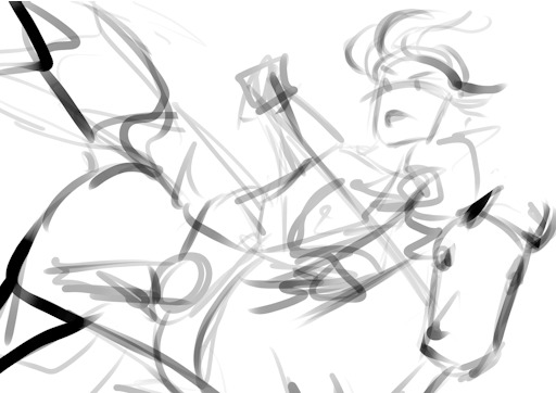
#codacheetah#my art#utdr#deltarune#kris dreemurr#kris deltarune#spamton neo#<- he's there in spirit#if i think abt kris and the sneo fight for too long i lose my mind so i blacked out for a few hours#i have not yet decided if i like this one bc i'm typing this at midnight.#but this was a fun chance to use firealpaca again and make something with a Real Background that uses Perspective#crazy!
239 notes
·
View notes
Note
do you have any tips to improve with art or art style? im so done w my own style and i think it looks dumb but idk how to change it ._.
Sorry I’m answering this kinda late but I really had to use my braincell to think what to say and I was worried these would be no help to others and it would just be me rambling. Here are some things that have personally helped me. I can’t promise these will help you but it’s worth a try, right? (I have a little trouble putting my thoughts into words bare with me)
1. Studying other artist’s work. Could be a famous painter from centuries ago, an artist over the internet whose work you like or your little sibling.. “Studying” might be a poor word choice for it but by that I mean staring at their work and going: “I like the thing x they do I should try that.”
I’m not telling you to copy someone else’s style but I think it’s valid to be inspired by other people’s style
2. Consuming media in general. And by this I mean all media you think is neat.This is one of the biggest things that have helped me. You don’t even have to do this having a little study session in mind. Just sit down and enjoy the thing and there is a pretty high chance you just. pick up something without even noticing it. I’m looking at you, video games. [camera zooms to my Steam library]
3. Experimenting. It’s a good idea to sometimes try something different and it could also be fun. You are free to go absolutely feral with this. No one is powerful enough to stop you. At one point I tried multiple different styles and ways to draw things. I still sometimes do this.
It could also be just trying a different art program or other tools
I sometimes don’t have access to my Clip Studio Paint and I have to use something else like Krita or FireAlpaca and that has forced me to do things differently. I have learned some new things just by using a different art program and brushes. Fun fact: after I tried Clip Studio (the free trial) for the first time my style and the way I work on my art changed a LOT in a number of ways even tho I continued using Paint Tool SAI for a while before buying Clip Studio Paint for good. No regrets. Keep in mind that expensive tools =/= good art. I have seen people do amazing stuff with Gimp and Paint and this one artist I really admire uses FireAlpaca
4. Reference pictures. Ah yes the classic. Looking at real life pictures of people, animals and items is a massive help. I have to confess that it took me a long time to learn that using references in perfectly fine. I blame 2010 deviantArt for making me think using them is cheating. It’s not. And speaking of deviantArt.. there is this account that posts a lot of reference pictures for poses called SenshiStock (warning: you are going to see people in underwear). When I need a reference picture I usually visit their gallery first. I’m still learning to search and use reference pictures myself so I don’t know where else to guide you... yet. Also I really recommend taking pictures of your own hands to use as references.
5. And finally... Patience. I know it’s easier said than done to be patient with art. Trust me I sometimes just curse at my own drawings too.. and then at my hands. It’s perfectly okay to get frustrated sometimes. Things don’t always happen instantly and sometimes after learning a new trick you might have trouble doing it again later and that’s okay.I actually have made pretty funny and relatable comics out of frustration and one time even won a little medal in a comic contest my old school was holding with one of those lmao. Maybe I’ll manage find a few of them to show to the internet. So yeah you can also turn your frustration into something you will enjoy. I accidentally found my love for making short comics that way.
Bonus thing: Please do your best to learn to get out of the “this artist is really good and I will never be as good as them” mindset as early as you can. It can and will slow you down and will do your mental health absolutely 0 favors. You could instead try thinking: “This artist is good. What can I learn from them?” for example. I know it’s not easy. I’m still stuggling with this myself but I’ve been doing a lot of progress so yay me
Bonus thing... 2!!: Do art for you and you only. If you are really passionate about the thing you are doing it will make you more powerful. I’m not exaggerating I’m being dead serious. Why do I make so much shitpost art? Because it’s fun. I really, really love doing it and the validation I get from it is only a nice bonus.
I hope any of this helped. I’m pretty tired so if something sounded confusing... I’m sorry. Keep in mind thatby all means I’m not a professional and I’m like 98% self-taught. I’m still learning myself aiurghidruhri
If anyone happens to have anything to add you are free to do so!
21 notes
·
View notes
Note
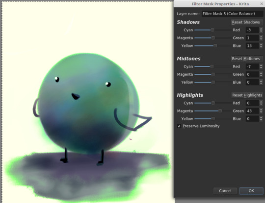
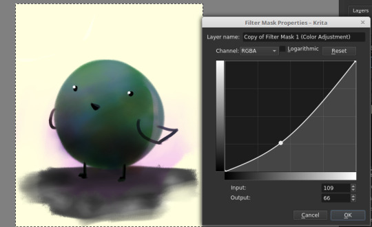
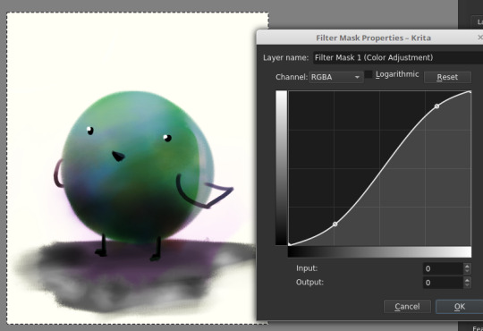
Do you have a tutorial or guide or anything on how you do colors because all of your pieces have such nice colors and lighting Seriously, the use of colors in your art isn’t something I’ve seen very often; I was wondering how you choose them & how you get those effects with the software? Thanks so much is advance if you choose to answer this :)
Thank you ;;;_;;;!! I do, but I think it needs a revamp.
I’m going on a very long ramble.

(Heads up! I’m not professionally trained, I have just watched and read a lot of tutorials and deviated from there with my own thing. Unless it has something to do with color blending modes, there is a good chance that I am using a silly fake term for many of these concepts. Also, I use Krita, but everything here should also be done possible on Photoshop, Medibang, GIMP, and I believe Clip Studio Paint. Autodesk Sketchbook and MyPaint don’t have filters like color balance, sharpening, etc. and I don’t know of an easy way of changing the saturation of a painting on SAI and FireAlpaca easily since I’ve never used SAI, I’ve only used FireAlpaca once in a blue moon, and searching for either doesn’t give a “one click” option that doesn’t require undos... but everything about color choices/lighting/color filters/blending-modes-that-aren’t-saturation should stay the same.)
There’s as many ways for things to be beautiful as there are birds in the world. But that’s too many birds, so its good to have a process that you try to follow. This is kind of an ideal setup, but I think this is how streamlined I wished I paint. (I usually bop between consolidating colors and adding detail, continuously, for all eternity until i give up and smash that post button blindfolded. I’ll explain what this means.)
So color wise, I try aim for two things: good value blocks and balance (cohesion), and interesting hue variation (jitter).
------
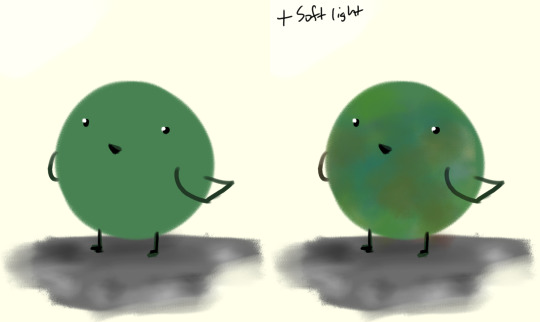
Setting the Ringabel painting with the saturation at 0%/setting the colors on grayscale, then simplified:


These blocks of different colors both provide structure to the painting, and also add to the composition. The thing I want people to notice most - Ringabel’s beautiful, luscious hair that he lovingly tends to every morning (and his face I guess) - is the area with the most contrast. There are logical-ish subdivisions between each part of the painting and I want to preserve these chunks of logical blocks throughout the painting process, or swap them out for Even Better Blocks.
Even then, I want there to be visual interest and a balance of values around the entire piece, which is why I added lighter glitter around areas that aren’t interesting enough to have real detail. No one is going to stare at that area too hard, but without it, this dynamic painting feels too empty.
Also, if I were to do the painting from the ground up again from this thumbnail, I’d also include gradients, to aid in carrying the eye to the focus having a better base to build on.
This also makes it easier to play with the lighting before getting to the meat of the work!

----
If we take Ringabel to max saturation, you can still see a bit of the value blocks, but there’s just a lot of colors slapped around everywhere:

I like this effect because it squeezes the maximum amount of visible interest out of a block of color as possible while still keeping the cohesion. And it’s not too hard to do - when you shade your painting, use two different colors instead of just one. When you add lighting, use two different colors. When you have a blob of color, slap some random color on that blob using a softlight blending mode.
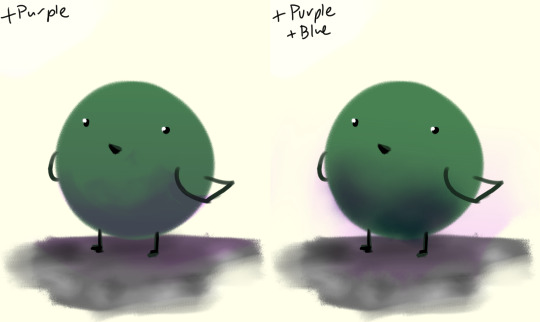
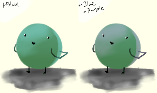
If there’s a concentration of color around an area and there’s an unbalance, add that color on the other side of the painting, to balance.
I like to call this jitter.
----
Let’s talk about cheating really quick:
“I kinda want mess up the colors but in a way thats kinda consistent”
“This is too bright.“
“This is too dark.“

“There’s not enough contrast!! >:(“
“Too much !!!! Contrast!!!!“

“THIS IMAGE WAS SUPPOSED TO BE PURPLE“
There is magic in the filter list. Jump in and have fun! (And fix your stuff.)
----
And.... that’s the philosophy.
Keep big chunks to stay organized
But have randomness to be fabulous
No shame in fixing mistakes.
----
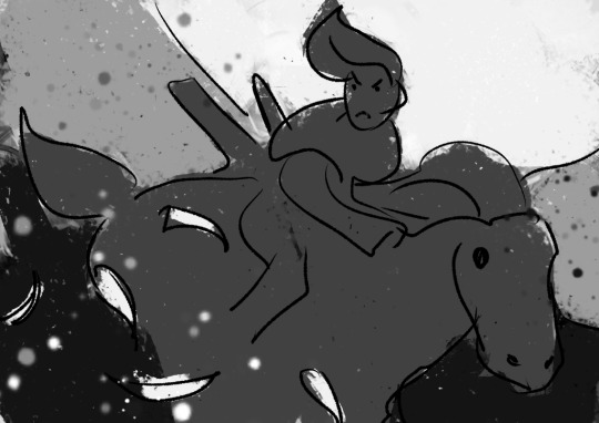
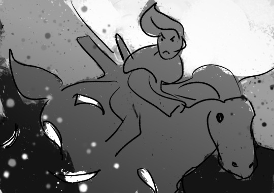
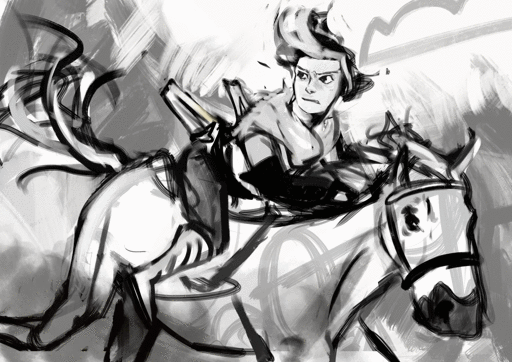
So from that, actual painting process for Ringabel on a Horse (clop clop). Here’s the thumbnail, which I drew before I knew how horses worked:
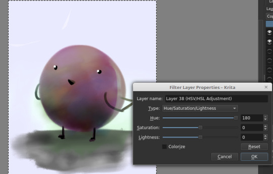
Then we choose hues. This will change over the course of the painting; I ended up with Green, then Red, then Yellow, then blue?
Then, allocate the colors in this way -
Dominant Lighting, Secondary Shading
Secondary Lighting, Dominant Shading
Rim light, another light source
Random random pops of color. because why not.
And pop them in this order:
Base/lineart
Initial color
Random colors (literally any color on the wheel) - Softlight/overlay - introduce jitter
Area Light 1 - (1) - Softlight/overlay - cohesive light
General shading - (2) - Multiply - cohesive shading
Detail shading - (1) - Multiply - jittery shading
Rim light - (3) - jitter - Softlight/overlay/COLOR DODGE - cohesive, out of left field light
Area light 2 - (1) -Softlight/overlay/COLOR DODGE - cohesive light
Detail - ;;_;; - FIX YOUR MISTAKES, C L E A N
Consolidate - (All 4) again to fix colors from the detail portion
GLITTER - (All 4) - jitter, glitter
Filtering - :D
The idea for 4-9 is that we have a balance of detail (jitter) and cohesion that we need to upkeep, and we need to strike a balance between adding cohesion and removing detail, and vice versa. Usually, I repeat those steps over and over and over and over, trying to get it just right. I tried to keep it simple here for the sake of the tutorial and my own sanity.
And now we do the thing.


Thanks for sticking around, and have a fantastic day!
#tutorial#art tutorial#digital painting tutorial#painting tutorial#sorry this took so long#thank you for the request#and have a good night!#hotvivitea
19 notes
·
View notes
Text
Welcome to Tumblr’s First LazyTown Zine Project!

What is a zine?
A zine is a self-published magazine created by fans for fans as a way of commemorating a form of entertainment, and sharing artwork and written work amongst a fanbase. It’s also great for making new friends and getting your work out there!
Why make a LazyTown zine?
If you’re considering being a part of this piece, you probably know just how important this show has been for viewers all around the world. It’s a lively showcase of hope and determination and holy sportcandy, it’s just so fun!
How Do I Apply?
You can use this Google Form HERE to submit to us a link to your work, either your art blog or fanfiction website! If you have your own portfolio, add that too!
If you have any questions about this process, don’t hesitate to send us an ask!
APPLICATIONS ARE DUE BY: November 5th
-If you’re interested in a physical copy of the zine, we’ll be posting pre-orders for it once everyone has submitted their artwork! There will also be a link to purchase a digital copy as well.
-The cost will be determined once all artwork and writings are sent to us!
-Proceeds will be donated to Stefan Karl’s GoFundMe page, and if possible, we would like to send this to the wonderful man himself.
Rules:
For Artwork
This zine is going to be Rated G, as we want to pay homage to the true spirit of the show. If you’re interested in shippy pieces, that’s fine, but know your limits: All pieces should be SFW, gore-free, and child friendly.
All art should be made in a digital format (Photoshop, FireAlpaca, SAI, etc.). If you’d prefer to create work in a traditional format, that is fine as well, as long as it’s in the proper dimensions and looks clean and professional. Remember, this piece will be printed.
Work needs to be emailed to [email protected] as a 7x10in JPEG, in CMYK, at 300dpi. Max 2 pieces of art.
The max number of artists for this zine will be 40. So there’s a good chance you could get in!
For Writing
Written works should be no more than 1,000 words and should use canon appropriate language. You don’t have to infantilize your writing, just don’t have Ziggy dropping any F-Bombs, ya dig?
That being said, they should also contain ZERO sexual content or graphic violence. As a guideline, just make sure the content is something you wouldn’t mind your younger siblings reading.
Email work to [email protected] in PDF format. Works should be no more than 1,000 words, and make sure to have grammar and spelling checked. If you are not sure who to go to for this, either of us will happily beta read your piece.
Only 10 written pieces will be accepted for this zine due to page number constraints. We would also like to make sure we have mostly artwork for this zine. This shouldn’t deter you from sending your work in. “It’s probably not good enough!” isn’t a sentence we use in this town, guys. Send it in anyway and show off your awesomeness.
Note: If there is enough interest in using characters from the stage play Glanni Glæpur í Latibær and it’s predecessor Áfram Latibær, we will also allow those works! If that’s what you’re interested in, the Google Forms application is the place to notify us of that!
Extra Note: We would prefer to keep to the artist and writer constraints we have set, but if we really do receive an overwhelming amount of applications, we might see what we can do. Zine price will be based on the size, however, and that’s one of the factors that make up these constraints. That being said, please do not let this keep you from applying!! We love to see everyone’s work.
TIMELINE:
Applications Open: October 26
Applications Close: November 5
Announcement of Artists: November 11
First Check In: November 30 (simple sketch or fic snippet)
Second Check In: December 30 (more polished work, does not have to be finished)
Final Pieces Due: Jan 15
Release of PDF: TDB
If you truly feel like you cannot continue this piece, or perhaps feel overwhelmed, be sure to send us a message as early as possible so we can find a replacement. We can discuss what you have done, and if you ultimately decide to drop from the project, it’s understandable. Just know that once you drop out you cannot join again for this piece.
We will be understanding if you miss one of the check-in dates. We’re all busy people and sometimes things just happen. For the Final Due Date, you will have a 2 Day grace period, but any works turned in later than that will not be accepted.
Thank you so much for making this possible! Can’t wait to hear from you all!
-Mason & Miko
157 notes
·
View notes